The improved Sharesight interface. New body. Same engine.
As we've blogged before, the development of Sharesight features is based on the feedback we receive from you. Along with adding more types of investments, benchmarking, and mobile/tablet capability, making Sharesight even more user-friendly is critically important. People love using our product because it's intuitive. Investment portfolios are serious business, but that doesn't mean the software we use to track them can't evolve rapidly and look and feel like the apps we use for news, travel, or social media. So as more and more functionality gets added to Sharesight, keeping our product user-friendly, whilst surfacing new capabilities is something we need to plan carefully.
The bedrock for this future plan will be released this week, as we roll out our brand new user interface. If you're a beta user or elected to get a sneak peak, you've probably already seen the new look Sharesight. Not only is this a more elegant design, but our Product Manager and developers are happy because they can release new user-facing functionality rapidly.
 Hello, is it me you're looking for?
Refreshed, Crisp Design
The first thing you're likely to notice is the new interface uses more real estate than the old version. This is by design. If you resize your browser, you'll notice Sharesight responds accordingly. This is all part of maximising the amount of information you can view, based on your browser or device. We've also changed our fonts, text size, and generally added more spacing to our pages and tables. This has all been done to improve readability and increase the amount of information we can display at one time.
Tablet Compatibility, Responsive Design, Mobiles
After PC-based browsers, a huge portion of our user base logs into Sharesight on their iPads or tablets. Sharesight has been rebuilt using responsive design, which works beautifully on all tablets. Go ahead and give it a try. Not only will the pages render smartly, but so will the menus and overlays, even when you're in landscape mode.
Sharesight will now work more effectively on mobiles (browsers), although depending on the size of your screen, it won't be 100% optimised. We've heard your feedback about developing a mobile app, so we will. We've gathered some excellent feedback already on what you'd expect in a Sharesight app versus going to Sharesight on your mobile browser.
Better Charting
On the Portfolio Overview page and the individual holding pages, you'll notice larger, more usable charts. Again, the focus is on displaying more data, whilst making it simpler to comprehend. If you find the charts too large, you can elect to hide them on the Overview page. If you're thinking, "why the hell are they taking up so much space with those charts," there's a reason: benchmarking. One of the most common feature requests we receive is to add benchmarking. We'll soon have a project underway to allow for basic index benchmarking, but we plan on exploring contribution analysis (i.e. which holdings contributed/detracted what amount from my portfolio), and benchmarking/modelling against your other portfolios.
Overlays
In the past, in order to edit a trade or dividend, Sharesight loaded an entirely new page, where you did your work, and then reloaded again to take you back to where you were. That was a waste of your time. So, we've built overlays to allow you to quickly edit trades and dividends.
 Don't call me a popup. I'm an overlay.
You'll find many more design improvements throughout the app, especially in the menu tabs and account settings pages. A couple of our favourites are the top level portfolio value and return data on the Portfolio Overview page and the lightning bolt icons for automatically populated dividends and corporate actions.
We're already gathering feedback on our new UI, and listening for more. Get in touch via our community forum or social media channels!
FURTHER READING

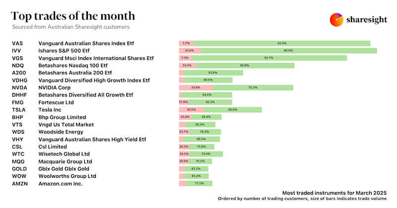
Top trades by Australian Sharesight users — March 2025
Welcome to the March 2025 edition of Sharesight’s trading snapshot for Australian investors, where we look at the top 20 trades by Australian Sharesight users.

Top 50 finance and investing blogs in 2025
Check out this list created by the Sharesight team, covering the 50 best personal finance and investment blogs from around the world.

Why property investors should use purpose-built software
We explore why property investors need a dedicated platform, and how connecting TaxTank and Sharesight can streamline portfolio management and tax reporting.