We’ve got a new look – Sharesight’s new brand
After a year-long effort of collaborating with customers, colleagues and investors, we are excited to unveil Sharesight’s new brand: a redesigned website with new colours and fonts, a refreshing approach to imagery, an evolved logo, and a highly refined product!
1. Why rebrand?
In 2007, the year when Steve Jobs revealed the first iPhone and the mobile revolution was yet to begin, Sharesight released the first version of our brand. Fifteen years and several iterative transformations later, we decided it was the right time to step back, re-evaluate and rethink our entire brand.
Our goal was to create an experience with our customers that would pay homage to our early roots while crafting our vision of a modern Sharesight. Rather than outsourcing to an agency, we decided to undertake the project in-house and leverage our outstanding team of developers to handle the minute details with the quality and care our customers deserve.

2. Shaping our brand
Our mission has always been to provide clarity over investments for beginners and experienced investors alike. When the design team started a year ago, we exhaustively interviewed customers on how to improve every aspect of our service and product.
At the core of our rebrand, we brightened our colour palette and added a bold and confident font type called Financier, designed by New Zealander and world-class typeface creator, Kris Sowersby. To reflect our ambition to help provide our customers with insights and a deeper understanding of their investments, we redesigned our magnifying glass logo into a radar.

3. Building our website with our community in mind
Maintaining our community at the forefront of our rebrand allowed us to redesign our website to satisfy our customers’ needs.
We employed a series of surveys and testing scenarios for a subset of the community to extract the information we needed to rebuild our pages. Every change we made evoked confidence, inquisitiveness, and intellect; characteristics we aspire to embody with our new brand.
In addition, our social media posts have evolved to effectively engage with our community and guide them towards robust resources and practical tools.

4. Rearchitecting our product
After prototyping and taking our customers’ feedback into consideration, we discovered three potential areas of improvement:
-
Rethink our navigation to ensure core features are easy to find
-
Incorporate accessibility and mobile compatibility into the interface
-
Make the portfolio snapshot and reporting the core of the experience.
We iterated and incrementally released the implemented changes throughout 2022, ensuring that each release was better than the last.

5. What’s on our radar
The new brand is only the beginning and serves as the foundation for upcoming features. We look forward to providing deeper analysis via reporting, introducing additional asset classes, and revealing new prototypes that will continue to improve usability and accessibility.
Thank you to all who continue to help build Sharesight by providing feedback, and testing complex scenarios and prototypes!

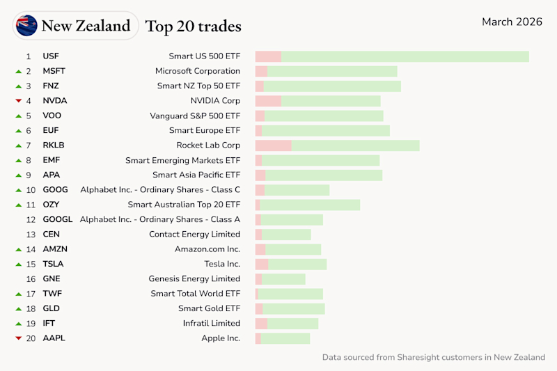
Top trades by New Zealand Sharesight users — March 2026
Welcome to the March 2026 edition of Sharesight’s monthly trading snapshot, where we look at the top 20 trades made by New Zealand Sharesight users.

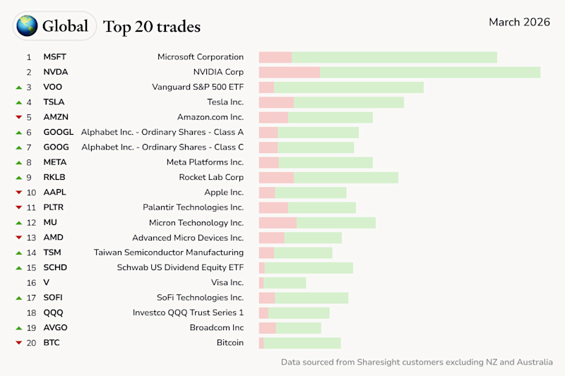
Top trades by global Sharesight users — March 2026
Welcome to the March 2026 edition of Sharesight’s monthly trading snapshot, where we look at the top 20 trades made by Sharesight users around the world.

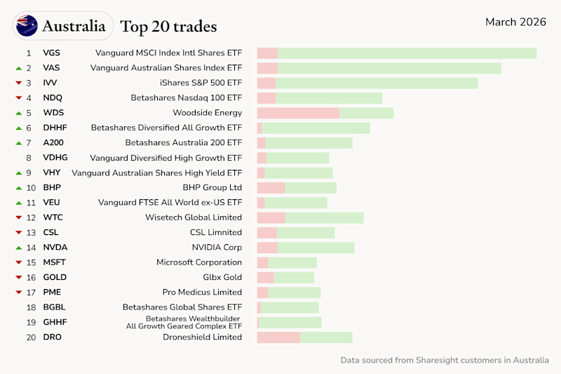
Top trades by Australian Sharesight users — March 2026
Welcome to the March 2026 edition of Sharesight’s monthly trading snapshot, where we look at the top 20 trades made by Australian Sharesight users.